

Back to all projects

as you are
Connection Through Ikigai
Building a culturally immersive dating experience inspired by Japanese ikigai, emotional compatibility, and self-discovery. Native is a Japanese dating app focused on creating deeper connections through personality insights and compatibility-driven experiences.As the sole designer, I led the experience end-to-end — from research and user flows to interaction design, visual language, and the final mobile interface.
UI/UX Designer
ROLE
0 → 1 Product Design
SCOPE
2-3 MONTHS
TIMELINE


About Native
Native is a Japanese dating app designed to create deeper connections through ikigai-inspired personality insights, emotional compatibility, and native energy mapping.
The experience goes beyond traditional dating apps by helping users explore their personality traits, emotional needs, love compatibility, and ideal partner characteristics through personalized Native Energy Cards and interactive compatibility experiences.
Emotion-Based Research
Because dating is deeply emotional, the success of Native depended on understanding how users wanted to feel while interacting with the product. Using a framework inspired by Positive Emotional Granularity Cards, I explored the emotional states users associated with meaningful digital connections. Through interviews and guided discussions, users identified emotions they wanted the experience to evoke during moments like matching, discovering compatibility, and exploring potential partners. These insights directly influenced the app’s onboarding, interactions, visual language, and overall emotional tone.

NAVIGATION FLOWS
The navigation flow for Native was designed to create an intuitive and engaging journey centered around self-discovery and compatibility. Users could set preferences, explore their Native Energy Card, discover personality-based matches, and view celebrities with similar compatibility traits.
To simplify onboarding and improve engagement, the app included social logins, personalized recommendations, and interactive compatibility exploration. Starting from low-fidelity sketches, the experience evolved into a seamless mobile interface focused on meaningful connections and emotional engagement.

STYLE GUIDE
Poppins
Bold
Medium
Regular
as you are
native.
BRAND
COLORS
BUTTONS
FONT
Primary
#BE94C6
#BE94C6
Secondary
Neutral
#D9D9D9
#1E1E1E
Neutral
Decline
#F36364
#6FCC42
Accept
MOBILE MENU
PRIMARY ICONS

WIREFRAMES
The wireframes for Native focused on intuitive navigation, emotional engagement, and compatibility-driven interactions. Users could easily explore recommended profiles, view Native Energy Cards, and understand personality and compatibility insights through clean, visually accessible layouts.
The experience emphasized simplicity through minimal communication flows, structured onboarding, interactive match exploration, and organized preference management designed to support meaningful user connections.


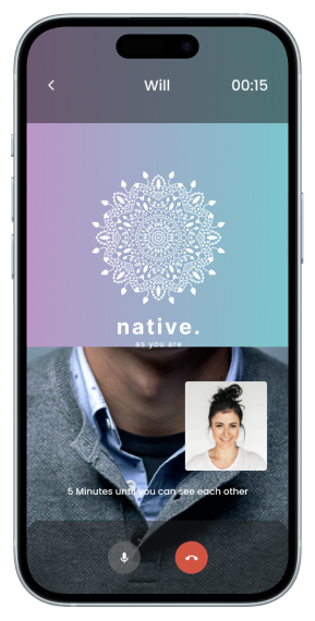
USER INTERFACE
The UI of Native was designed to create an emotionally engaging and intuitive mobile experience through soft pastel visuals, personalized compatibility insights, and minimal interaction patterns.
Features like the Native Card, compatibility mapping, and celebrity comparisons added playful engagement while supporting self-discovery, emotional connection, and ease of navigation throughout the experience.


FINAL STEP
The product is currently in development, with ongoing user testing and iterative refinements focused on improving usability, emotional engagement, and compatibility experiences. The next phase involves finalizing feature integration, optimizing onboarding flows, and preparing the platform for launch.
Next case study
